Marketplace consumers are besieged by choice overload.
Challenge
When shopping for insurance coverage on the Healthcare.gov Marketplace, consumers are often presented with 100+ plans. This number of choices leaves them feeling overwhelmed and frustrated, and uncertain they will be able to select the “right” plan.
How could we begin to alleviate their obvious choice overload in an intuitive and accessible, familiar way?
Process
Defining the problem
There are two ways to view available plans on the Marketplace. The first is in an application called Window Shop. It doesn’t offer the ability to enroll, but it also doesn’t require registration or sign in. The second is called Plan Compare. This is the authenticated enrollment flow and it cannot be reached without completing an application that determines benefit eligibility.
We began by reviewing past UX research and talking with stakeholders. What we heard was Window Shop Plan Likes was designed to provide consumers a way of locating the plan they liked using the 14-character plan ID inside the enrollment flow of Plan Compare. What we quickly discovered was that the feature was often adding friction to the task of selecting a plan. Let’s take a quick look.
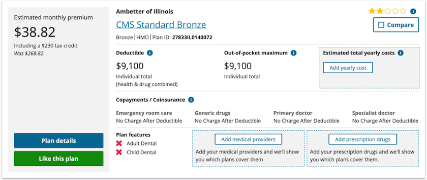
When viewing plans in Window Shop, a consumer could fairly expect that clicking Like this plan performs an action similar to other sites.

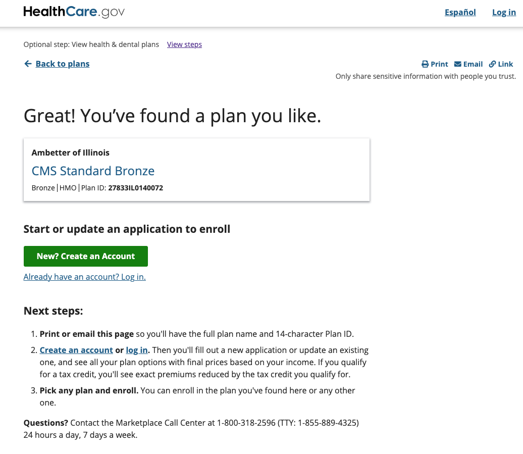
The button’s link behavior instead took them out of the plan shopping flow to a page that enthusiastically congratulated them on finding a plan they like with a to-do list, but no way clear way of recalling that plan.

Returning to the list of plan results at this point provided no indication that a plan had been “liked”. Perhaps the worst offense was that the UI never made clear how to move to the next step in the journey without liking a plan.
Saving plans
Consumers have come to expect similar functionality from sites where the job to be done ends with completing a purchase. Filter, sort, compare, and even a wish list, are all offered to support buyers’ decision making process.
We knew a successful solution needed to 1) allow consumers to reduce the number of plans they have to consider without taking them out of the current flow, 2) meet consumers where they’re at and align with their expectations, and 3) add an additional element to every plan card without increasing cognitive load (tough ask!) in a way that isn’t easily overlooked.
“Liking a plan” also didn’t feel right. For most consumers, health insurance is a purchase they hope they’ll never need, not something they like. What, then? Bookmark? Save? Add to list? Which of these best describes the action consumers are hoping to take? Does it encourage them to hire this tool for the job? It turns out the functionality provided a clue.
The interaction model needed to provide immediate visual feedback while enabling consumers to stay focused on the task.

The Compare button had the right feel, provided the visual feedback we were looking for, and allowed for easy correction. How could we make our new button unique while staying consistent? This made saving a plan an easy choice.
Fortunately for the team, my cohort The Real Mike Henderson was doing great work on updating the plan cards at the same time we were working on saved plans. This afforded us the opportunity to think heuristically and consider improvements that would have otherwise been waaay out of bounds.
In the end we were able to group plan card actions together and align them visually in a way that built consumer trust and confidence.


Viewing saved plans
With an updated plan card and a cohesive set of actions for window shopping, we moved to viewing the saved plans.
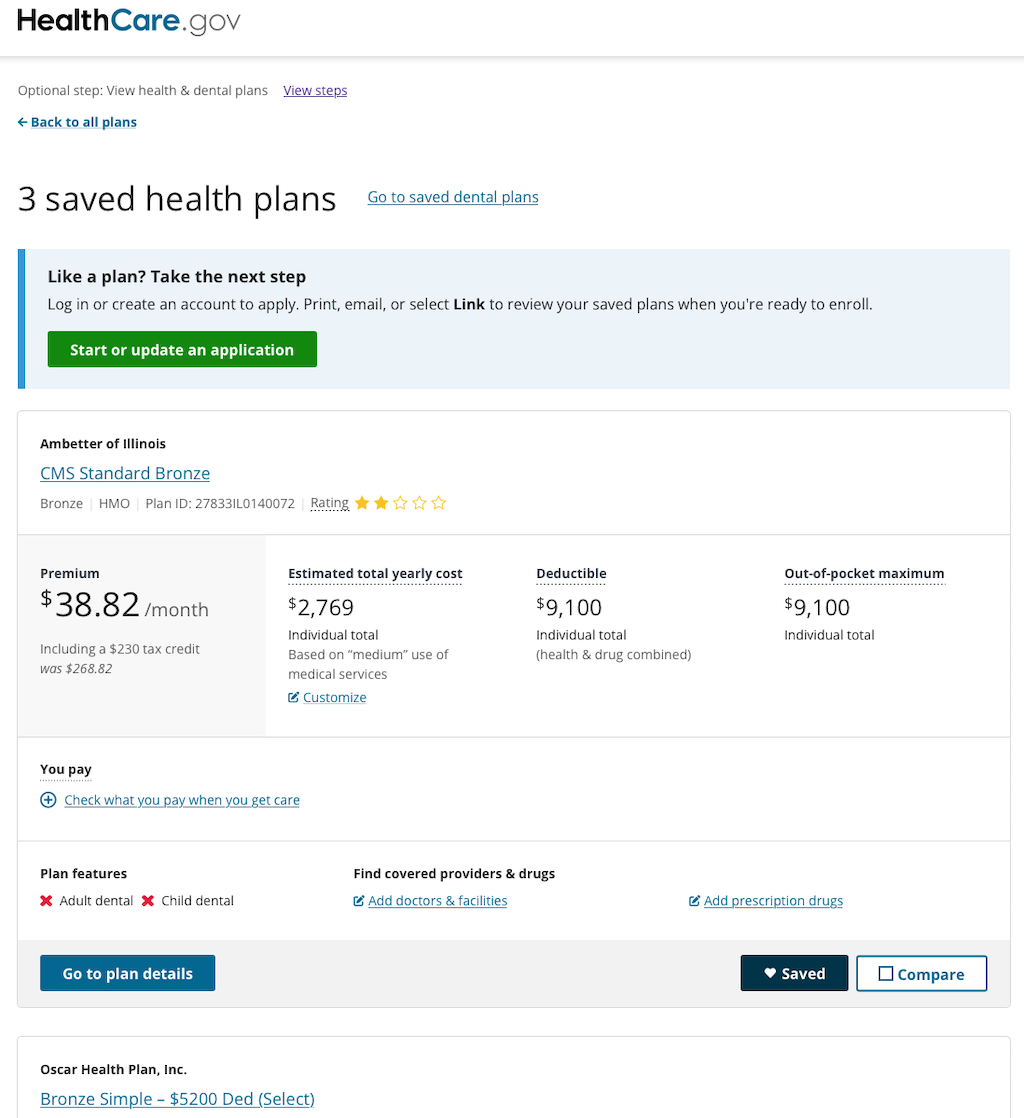
The right solution for the available time was presenting the full plan cards of saved plans.
This though translated into a page that lacked a unique sense of place in the journey. Were there other visual cues to inform consumers that they were viewing plans they had saved, not the plan results? We chose to include the current number of saved plans in the page heading. If a saved plan was removed, the number in the heading was updated. We also added an info alert above the list of saved plans for new consumers who were maybe unfamiliar with what their next step should be.

This led to someone presenting one of the project’s more interesting thought experiments. What happens when someone removes a saved plan? Does the plan card dissolve? What if this was done by accident? We decided the best way to support consumers in this case would be to toggle off the Saved button and update the count in the heading. The plan card would remain on the page until the next page load.
There is one aspect of Saved Plans that requires rather immmediate iteration — where are my saved plans? Without going too long on the technical side, the user experience of Healthcare.gov is spread across many product teams. This meant we weren’t able to locate the navigation to Saved Plans where one’s mental model might expect. Whatever we chose to do needed to be within the Plan Results page where it would more than likely be missed the first time around. Removing that friction and making this intuitive for all consumers will require multiple teams working together.

Already at the end of our appetite for the project, the considerations we didn’t have time for are sure to inform any future work. Which bits of plan information are most valuable at this point of the journey? Could viewing saved plans simply function as a filter within the plan results? Or is this better as a standalone page? If so, why? Is there a way of presenting the information that is better suited for comprision and comprehension?
Outcome
Window Shop Plan Likes was originally conceived as a way of connecting the two plan shopping experiences. The team, however, delivered Saved Plans to both Window Shop and Plan Compare, and the response from consumers exceeded our expectations. The Enroll call-to-action on the Saved Plans page in Plan Compare had the highest engagement rate of all pages including this CTA, outperforming the Plan Results and Plan Details pages.
The team is already eager to begin experimenting improved ways of navigating to Saved Plans and learning whether or not the initial response by consumers can be considered baseline.
![]()