Transcribing audio is a time-consuming, manual process that can be prone to errors.
Challenge
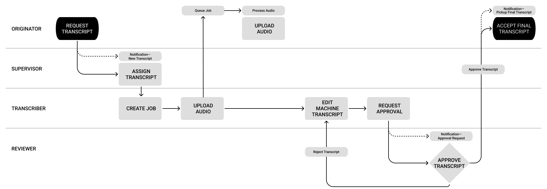
We were approached by a federal customer whose transcript demand had outstripped its capability. They were looking for a way to reduce the time needed to produce a transcript without yielding accuracy. They also hoped that a technical solution could connect related documents. We knew this was the “killer feature” given the fact that linking related transcripts and classifying data was an additional process with its own set of risks.
Process
Our research began by going deep on transcribing in general. We wanted to learn if a common toolkit or software stack existed? Was there an accepted industry standard(s) for accuracy? What techniques ensured, or even increased, speed? Where was this type of work typically performed?
 The initial prototypes focused on ease of use and readability. Leveraging affordances and principles of web typography would flatten the learning curve and keep things intuitive for a small but diverse set of users in a UI that needed to support large amounts of unstructured data.
I created an inventory of player app features that the team used in a card sorting exercise to derive our baseline. I presented a player with basic funtionality, but felt a personal bias and suggested testing different players. These prototypes quickly revealed that a simple player would not be flexible enough to support the workflow: users needed to loop segments, adjust playback speed, and more.
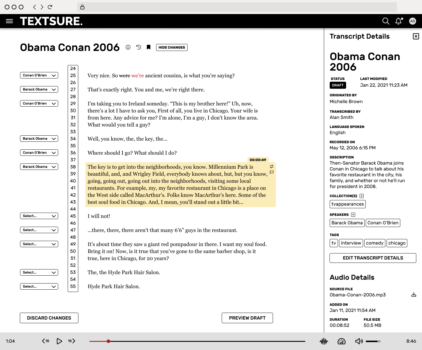
Testing provided many valuable insights, but one bit of user feedback affected an immediate change in our thinking about the player — recordings often contained extended periods of silence and users needed a visual way to move quickly through these breaks. The player in v1 offered more advanced controls with the option to toggle a waveform view on or off.

The transcript list view presented a different challenge. We wanted this page to visually offset the overall data richness of the application. Cards accomplished this goal, but one variable was not considered in the prototypes — what happened when there were 100+ transcripts? The card UI became overwhelming and crumbled under the weight.
Much of the functionality that anchored the initial release of TEXTSURE was the direct result of research and iteration.
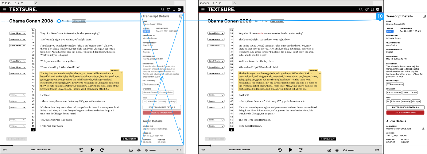
- The drawer became the primary way of interacting with a transcript’s meta data without leaving the editor. Collections, speakers, tags, and other data that described the transcript could all be viewed, changed, and augmented in the context of the transcript during editing.
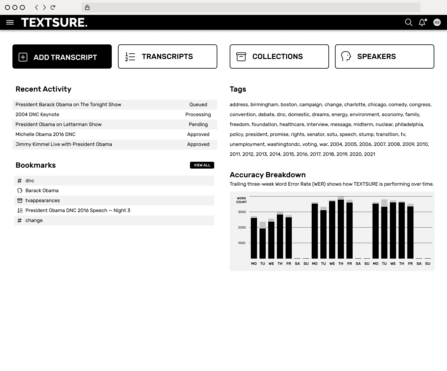
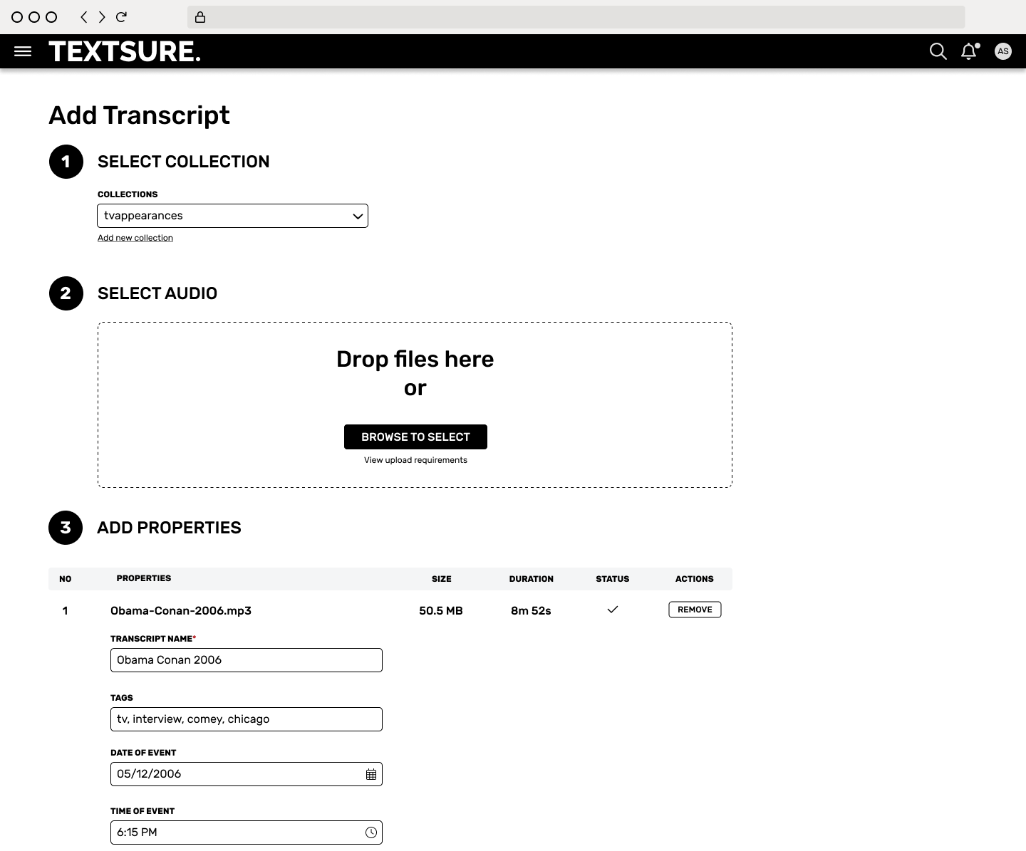
- Using tags and other unstructured data gave us the power to group otherwise unrelated objects. We intentionally steered the Add Transcript UI toward only requiring the data that we needed to process the file and fields where data types were important (date, number, etc). All other data would be unstructured text objects.
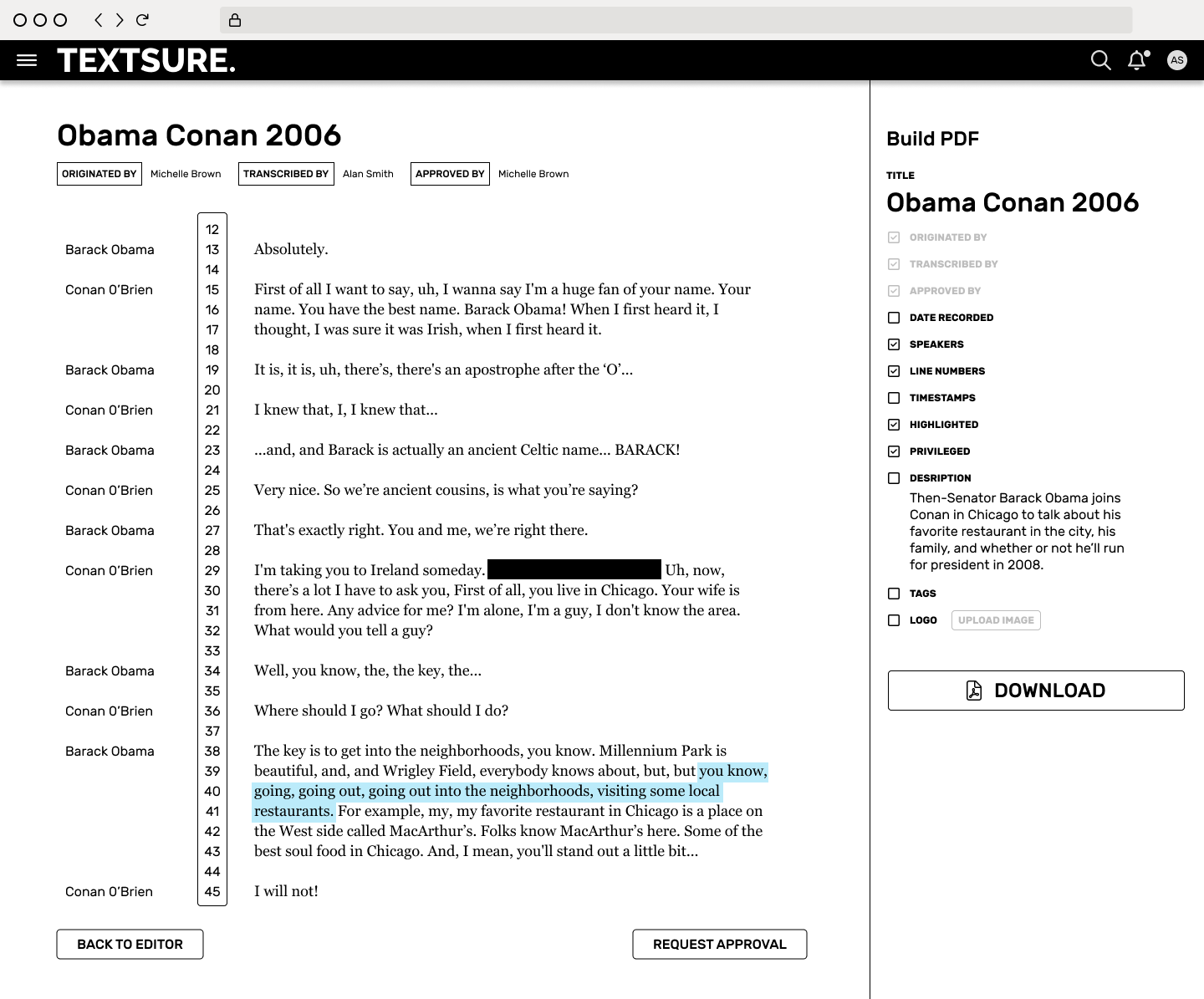
- A final transcript might contain many instances where discrete pieces of a recording were assigned characteristics — pertinent, privileged, further review, etc. These could be also be assigned as tags so pulling a list of privileged conversations could be done with a single click.
Low-fidelity prototypes were produced for each step of the process. We chose Figma for its powerful prototyping, collaboration, and developer handoff features.
Outcome
A common metric used for transcript accuracy is the Word Error Rate (WER). A human can average a slightly lower WER (~ 3%), but the benefits of only needing minor edits greatly outweighs the cost of manually producing a transcript. One user reported an 89% time savings when transcribing a 15-minute conversation using TEXTSURE.
The asynchronous nature of cloud processing and user review has been a productivity boon. Team members are now able to queue multiple files that complete in the background, freeing them to work in more valuable ways.
The product design team learned our own valuable lesson about how much data is right for the prototype.